
REDESIGNING THE BOARDING PASSES FOR AN AIRLINE
How I applied Lean UX to redesign both physical and digital boarding passes, improving clarity and usability while accommodating operational constraints.
Boarding passes are an essential touchpoint in the passenger journey, yet they are often a source of confusion and stress. They also play a dual role: they guide travelers with essential flight details and support airline operations by including information for agents. In this project, I redesigned two key formats:
- A digital version – provided for display on a smartphone or for printing at home after online check-in; used by passengers before arriving at the airport.
- A physical version – issued at check-in counters and handed to passengers who complete their check-in at the airport.
Using Lean UX, I focused on improving the layout and readability of both versions, ensuring a unified approach while addressing the unique requirements of each format.
INITIAL HYPOTHESES
To guide the redesign process and to stick with a Lean UX approach, I formulated the following hypotheses:
-
Problem of Comprehension
Poor organization and the lack of labels on the current boarding passes create comprehension issues for passengers. -
Highlighting Key Information
Emphasizing the most critical details—such as gate number, boarding time, and seat number—will make the travel experience smoother and less stressful for passengers. -
Clarity Through Labels
Adding explicit labels to each piece of information will help passengers quickly understand their flight details. -
Simplified Design
A cleaner, more structured layout will facilitate rapid reading and improve the overall user experience.
RESEARCH & BENCHMARKING
Benchmarking Across Industry
I analyzed the boarding passes of 20 major airlines worldwide, including both paper and digital formats. This benchmarking exercise provided insights into common design patterns, innovative approaches, and frequent usability challenges.
Findings:
- Many boarding passes suffered from overly cluttered designs, making it hard to prioritize information.
- Common frustrations were: (1) difficulties locating the flight number, gate number, seat or boarding time and (2) confusion caused by cryptic abbreviations or unlabelled information.
- Some airlines successfully used color coding, bold typography, and spacing to emphasize critical details.
- Digital boarding passes often lacked readability when displayed on smaller screens or printed.
Field Research with Passengers
To complement benchmarking, I conducted on-site research with passengers on several flights. I asked passengers what elements they looked at first when handed a boarding pass at check-in counters. This direct feedback revealed consistent priorities, such as gate number, boarding time, and seat assignment. Comparing these insights with industry practices allowed me to refine the hierarchy of information and ensure the most critical elements were prominently displayed.
Identifying User Pain Points
Through observations and passenger interviews, I identified common frustrations with the airline’s existing boarding pass, such as difficulty locating departure and boarding times and confusion caused by unlabeled fields. These insights directly influenced the structure and layout of the new design.
REDESIGNING THE IA
Challenging the Actual Layouts
- Prioritizing Information: I reorganized the layouts to give prominence to key details for passengers (flight, gate, seat, boarding time) while moving agent-specific information to a less obtrusive area.
- Adding Labels: Each piece of information was paired with explicit labels (e.g., “Gate,” “Seat”) to reduce ambiguity.
- Hierarchy of Details: I used typography, spacing, and grouping to establish a clear visual hierarchy
PROTOTYPING
Physical Boarding Pass
-
Sketches for Information Zoning:
Initial sketches on paper explored different zoning arrangements for information. These quick iterations allowed me to prioritize passenger-critical details while allocating space for operational information. -
Medium-Fidelity Prototypes:
At-scale prototypes of the boarding pass were created for the printed version, focusing on the practicality of the layout. These prototypes simulated the actual dimensions of the boarding pass and were essential for refining the arrangement of key elements such as gate, boarding time, and seat. -
High-Fidelity Prototypes for Realistic Testing:
High-fidelity prototypes for the paper version accounted for the specific characteristics of printers at check-in counters, including margins, resolution, and print alignment.
Digital & Home-Printed Boarding Pass
- The first digital prototypes were inspired by designs from Virgin Atlantic and ticketing systems in the entertainment industry, featuring a foldable format designed to fit neatly into a passport.
- This concept was abandoned when leadership decided to unify digital and print versions, requiring a redesign focused on adaptability across formats.
- The final digital prototypes emphasized clean design, consistent with the airline’s broader branding strategy, and reduced color blocks to minimize ink usage during printing.
TESTING
Physical Boarding pass
I conducted quick tests (guerrilla testing) with passengers at the airport, comparing the existing boarding pass with an advanced prototype.
Key findings:
Comprehension Issues in the Current Version:
- Over 75% of passengers either failed to locate the required information (e.g., gate number) or were unsure if they had found the correct detail.
Improved Performance in the Prototype:
- Highlighting critical information (flight number, boarding time, gate, seat) helped passengers locate details faster.
- More than 75% of passengers, who had never seen the prototype before, intuitively focused on the emphasized areas for key details.
Impact of Labels:
- Adding explicit labels (e.g., “Gate,” “Seat”) resulted in 100% of passengers identifying the correct information with full confidence.
- Information was found 2 to 3 times faster on the prototype compared to the current version.
Areas for Improvement:
- Hierarchy of Information: Passengers suggested that the distinction between labels and information could be improved with grayscale variations.
- Overloaded Stub: The boarding pass stub, frequently visible when agents inserted the pass into a passport, felt cluttered and caused mild cognitive overload.
Digital & Home-Printed Boarding Pass
I also conducted tests comparing the redesigned digital boarding pass with the version currently in use. These tests focused on usability, speed, and user confidence. Key findings included:
Significant Improvements in Information Retrieval:
- Passengers found information 2 to 3 times faster with the redesigned digital boarding pass.
- Critical details, such as departure times and boarding times, were clearly visible, reducing the time spent searching.
- The redesigned version instilled maximum confidence in passengers, with 100% correctly identifying the needed information on the first attempt.
- In contrast, the current version caused significant confusion, especially around departure and boarding times, leading to errors or doubts in most cases.
- The new design’s clean layout and explicit labels greatly improved readability on the printed versions and especially on mobile devices.
These findings validated that the unified format worked effectively for both digital display and printing, simplifying workflows and avoiding the need for two separate designs.
OUTCOME
The redesigned boarding passes brought measurable improvements to both passenger experience and operational efficiency:
- Improved Clarity and Usability:
Passengers were able to locate critical flight information—such as gate number, boarding time, and seat assignment—more quickly and confidently. The clear hierarchy of details and use of explicit labels reduced confusion, minimizing errors and delays during the boarding process.
- Streamlined Navigation Across Formats:
The unified design (for digital version) worked seamlessly for both digital and printed versions, eliminating the need for separate templates. This not only simplified workflows for the airline’s development teams but also ensured a consistent experience for passengers across platforms. - Enhanced Passenger Confidence:
The intuitive layout reduced cognitive load and stress for passengers, particularly during high-pressure moments like boarding. Feedback from user testing highlighted how the improved design made the boarding pass feel approachable and easy to understand. - Operational Alignment Without Sacrificing UX:
While operational elements required by agents were integrated into the design, they were placed in a way that did not interfere with the passenger-focused experience. The design balanced usability for passengers with functionality for airline staff, demonstrating a thoughtful compromise. - Support for Brand Identity:
The clean, modern aesthetic of the boarding pass aligned with the airline’s updated branding and reflected a professional, passenger-centric ethos. This consistency reinforced the airline’s commitment to providing a seamless travel experience.
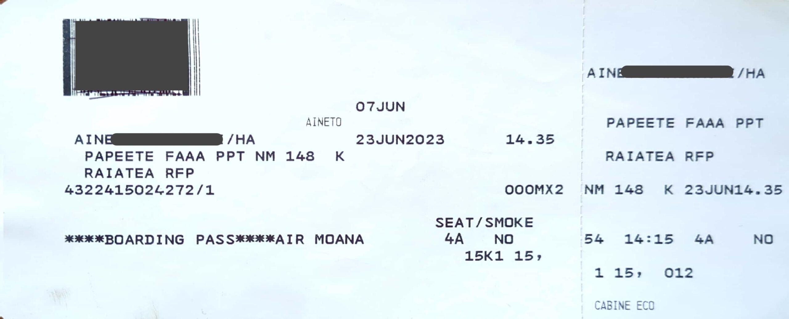
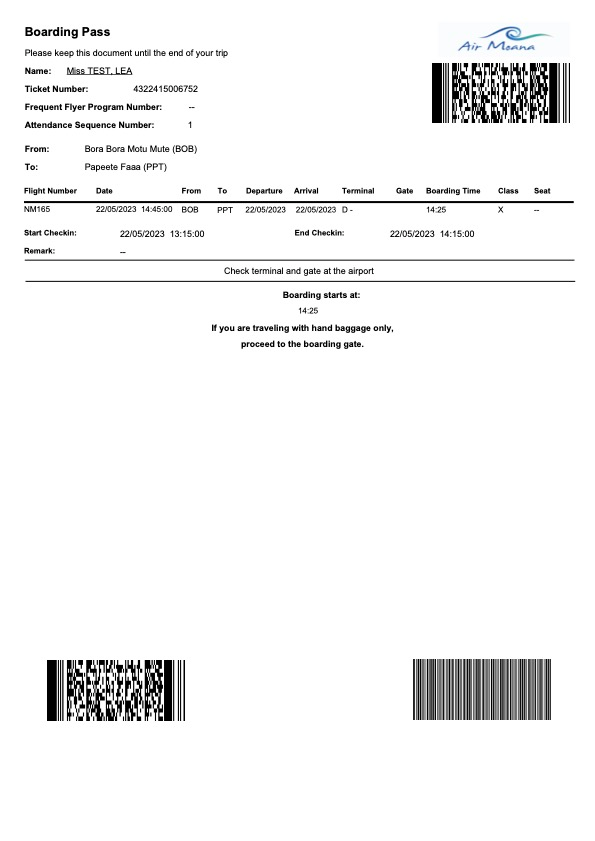
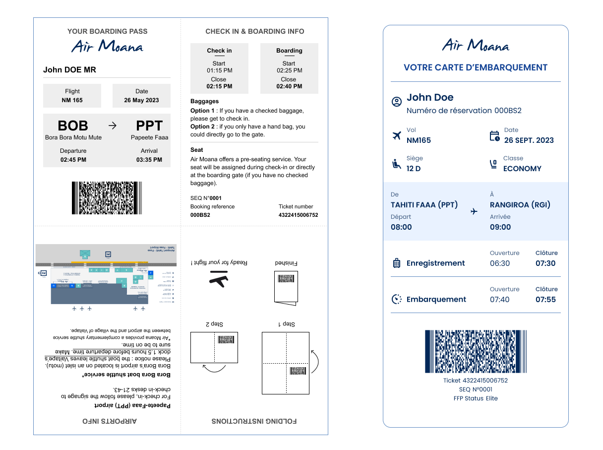
Comparison of the physical boarding pass: existing vs final prototype
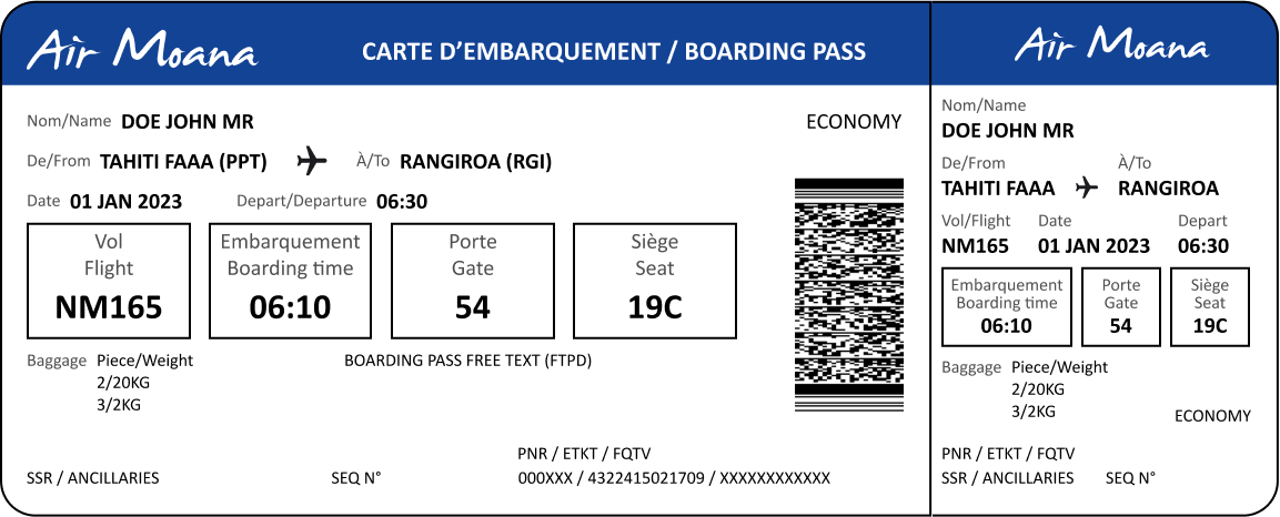
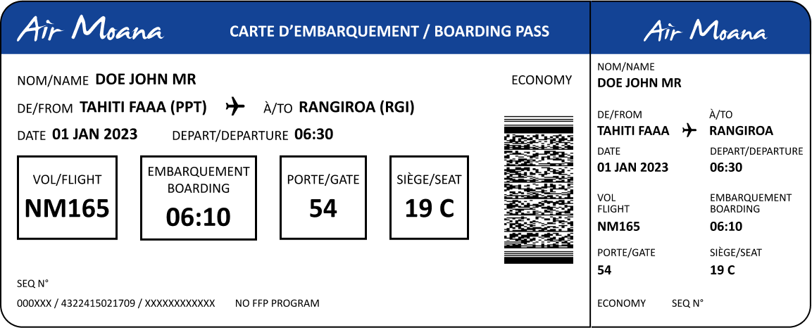
Comparison of the digital boarding pass (home-printed version): existing vs final prototype

REFLECTIONS
While the redesign successfully addressed major usability issues, I was unable to oversee its full implementation or make post-launch adjustments. Real-world testing after deployment could have further refined the design and aligned it more closely with my vision.
KEY TAKEAWAYS
- Holistic Design for Diverse Needs:
Successfully balancing the needs of passengers and operational requirements demonstrated the importance of designing for multiple stakeholders without compromising user experience. - Iterative Prototyping Enhances Precision:
Moving from paper sketches to high-fidelity prototypes ensured that each iteration addressed specific challenges, from usability to technical compatibility, resulting in a refined final design. - Unified Formats Drive Efficiency:
The decision to create a single format for digital and printed versions streamlined processes, reduced development costs, and provided a consistent passenger experience. - Research Validates Impactful Decisions:
Benchmarking global boarding pass designs and conducting user tests—both guerrilla and internal—provided actionable insights that directly informed the redesign’s success. - Brand Integration Supports Trust:
Aligning the boarding pass with the airline’s updated branding reinforced the professionalism and passenger-centric values of the company, building trust and enhancing the overall perception of the airline.
These takeaways highlight how research-driven, iterative design can address complex challenges and create tangible improvements for both users and stakeholders.
All rights reserved to Raphael Rouget and AIR MOANA.
Note: This case study was reviewed and refined with the assistance of ChatGPT to ensure optimal clarity and syntax.